thurbox TUI — UI/UX Review
This page is generated by the ui-review skill: it drives the
real TUI in an isolated sandbox, screenshots every screen, and critiques
each through four lenses — visual design, usability, consistency, and
accessibility. Re-run the skill to refresh it.
Summary — 40 findings across 12 screens
40 nits14 visual16 usability8 consistency2 accessibility
Top recommendations
- **Every finding on this page is now fixed** — two blockers and thirteen warnings — and the entries are kept as the record with what fixed each one. Screens 10 and 11 are re-captured after their fix; the rest still show the state that produced the finding.
- Two findings were corrected rather than acted on. The Interface tab was reported as missing its provenance and trust columns and is not — both are on the row already, and a default install simply has nothing to say. And one of these turned out to be a genuine logic bug rather than a styling choice: `ipairs` halting at a nil meant the search strip and the session list disagreed about what matched, on the same frame, for any session without a worktree.
- What is left is the twenty-five nits, which are unaddressed by choice rather than oversight.
Session list + agent terminal (default view) launch
nit
Fixed: an idle session is announced in the alarm colourconsistency
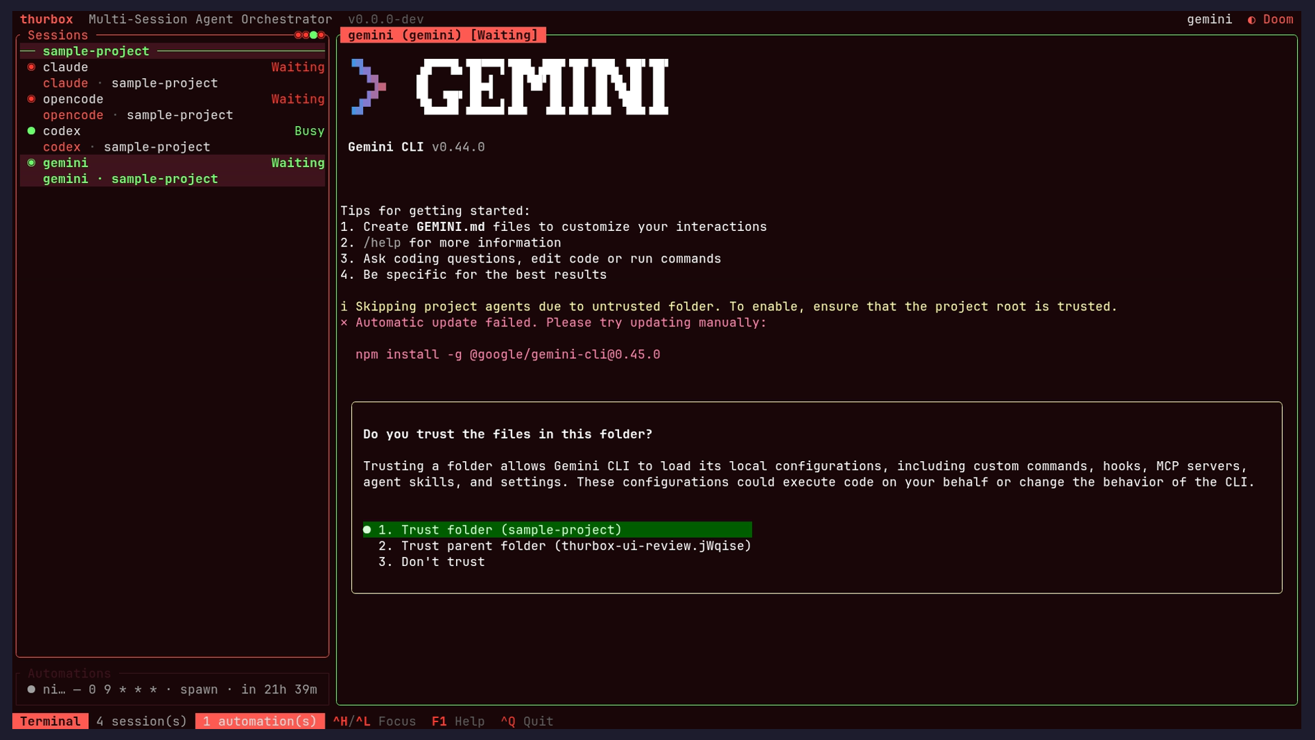
The badge over the centre pane reads `claude (claude) [Idle]` filled solid accent-red — the loudest treatment anywhere on screen — while the very same state is a calm green `○` in the session list two lines below. Accent-fill is also doing three unrelated jobs in this frame: the active `Agent` tab, the `1 automation(s)` count, and session identity.
**Fixed.** a frame title carries styled runs now, so the agent pane paints its status word with the same role the list gives that session's dot instead of the whole title sharing the focused accent.
Fix: Reserve the filled-accent treatment for one meaning. Let the badge carry the session's status colour (the green the list already uses for idle, red for blocked) so a glance at either place tells the same story.
nit
The border dots restate the rows immediately beneath themvisual
The ` Sessions ` border carries five `○` glyphs, one per session, directly above five rows that each already show their own status dot. At that size and contrast the row reads as decoration rather than as data.
Fix: Drop them while the list is visible and keep them for when it is not — collapsed or hidden by F9 is where a roll-up actually adds something.
nit
Three chord notations in one bandconsistency
The footer mixes `^H/^L` and `^O` with `F1`, `F4` and `^B` in a single row, so the same concept is spelled two ways an inch apart.
Fix: Pick one — `Ctrl+H` reads best for newcomers and matches the documentation and the help modal, which both spell chords out.
nit
A worktree session is marked but its branch is never namedusability
The `review` row carries a branch glyph, which says *that* it is a worktree session but not *which* branch. Two sessions on different branches of one repo are distinguishable only by the names their author happened to choose.
Fix: Append the branch after the name, dimmed and middle-truncated, as the info panel used to. It is the fact a worktree session exists for.
nit
The only structural divider is the dimmest text on screenvisual
`— sample-project —` groups the list by repository, but it is rendered darker than every row it organises, so the grouping is the first thing lost at a glance.
Fix: Lift the group header to the secondary text colour. It is a heading; it currently reads as a disabled row.
A different session selected Ctrl+J
nit
Three different greens stacked in the selected rowaccessibility
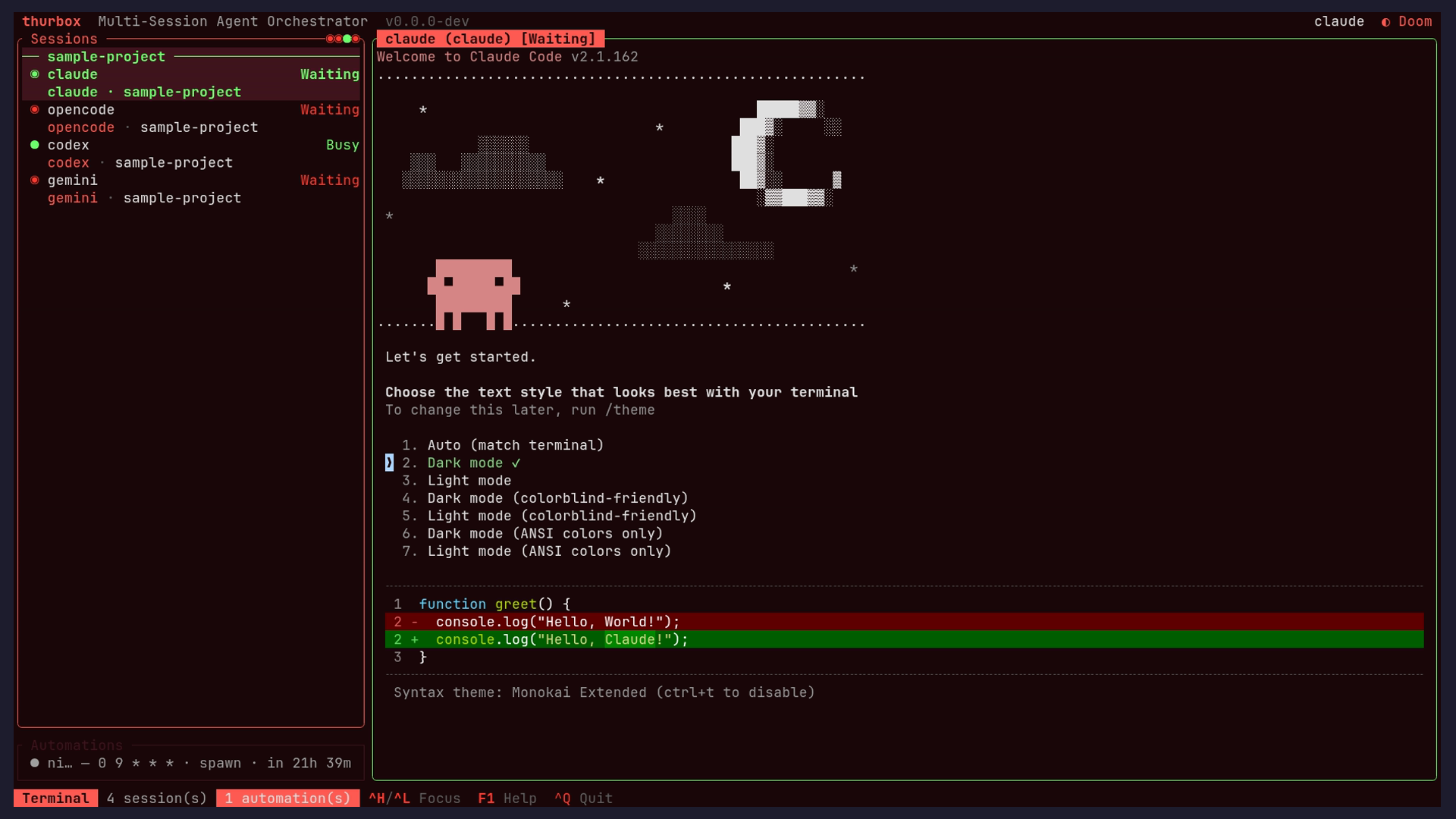
Selecting a row tints its background maroon and turns its text green, while its status dot is also green and the focused panel border is green again. The selected row therefore carries three greens with three different meanings, and selection is signalled by colour plus background with no glyph.
Fix: Keep the background tint as the selection signal and leave the row's text in the primary colour, so the green that remains means status and nothing else.
Search strip, matches highlighted in the pane Ctrl+/ + query
nit
Fixed: the pane dims rows the strip counts as matchesusability
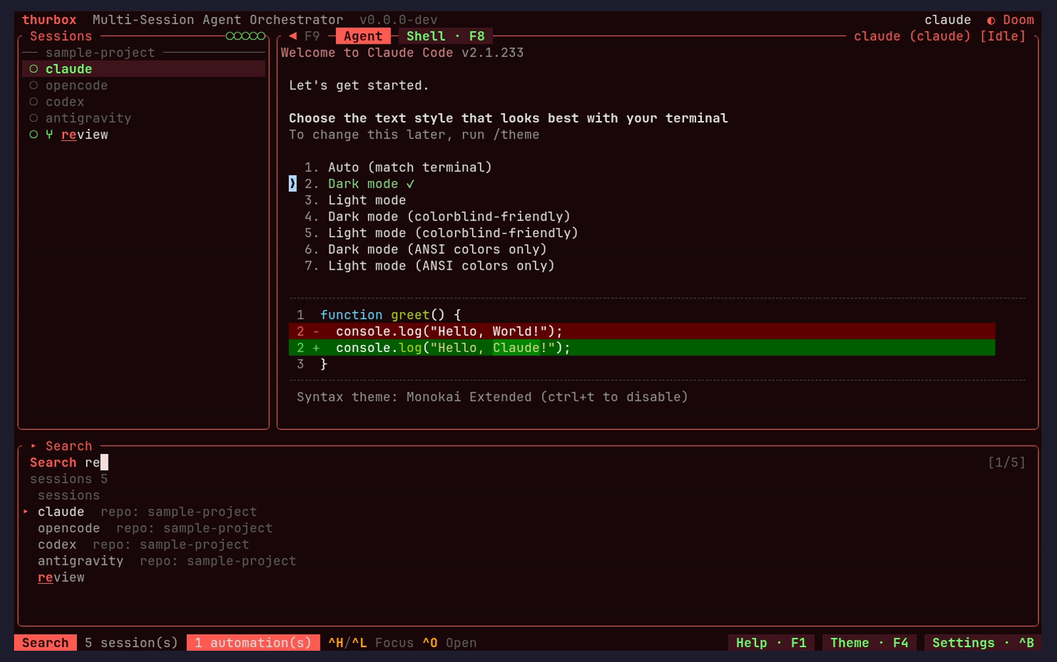
Querying `re` reports `[1/5]` and `sessions 5`, and lists all five sessions as results — four of them matched on their repository, which the strip helpfully annotates `repo: sample-project`. But in the session list itself `opencode`, `codex` and `antigravity` are dimmed, the treatment that means *not a match*. The two halves of the same feature disagree on the same frame.
**Fixed, and it was a real bug.** `name_hits` scanned `ipairs({ agent, branch, repo })` and **ipairs stops at the first nil**, so a session with no worktree never had its repository tested. Measured before and after — the three rows went from 101/1000 brightness back to 240.
Fix: Dim only non-matches. If the intent is to distinguish a name match from a repo match, use two levels of emphasis rather than reusing the not-a-match treatment for a match.
nit
The scope name appears twice on consecutive linesvisual
`sessions 5` is followed immediately by a `sessions` group header, so the same word labels two adjacent rows and one of them is pure repetition.
Fix: Keep the group header and move its count onto it (`sessions 5`), freeing a row in a strip that is already tight.
nit
The strip reserves twelve rows regardless of how many results existvisual
Five results leave roughly six empty rows below the last one, all taken out of the panes the search is meant to be highlighting.
Fix: Size the strip to `min(results + chrome, 12)`. Shrinking to fit is the same courtesy the status band already does by taking a row only when it has a message.
nit
The best match is the only unannotated resultconsistency
Four rows explain why they matched with a `repo:` tag; `review`, which matched on its name, carries nothing — so the strongest result looks like the one with the least information behind it.
Fix: Annotate every row with the field it matched (`name`, `branch`, `screen`), which also makes a screen-text match legible as such.
Theme picker (36 palettes, grouped) Ctrl+Y
nit
Fixed: the picker opens already scrolled past the topusability
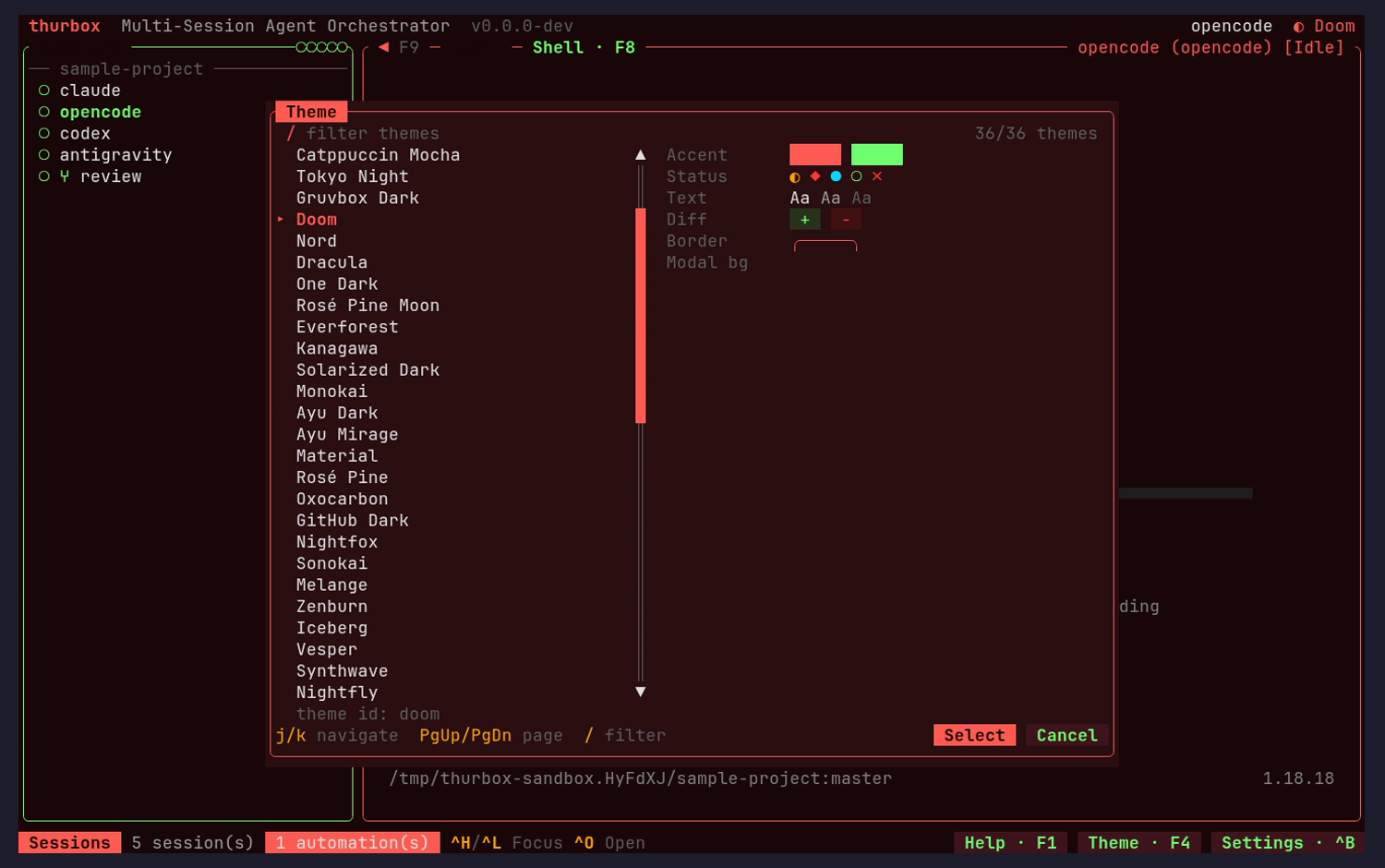
Twenty-six of the thirty-six rows fit and the selected theme is the fifth entry, so nothing needs to scroll — yet the list starts at `Catppuccin Mocha`, with a `▲` marker showing content above. `Default` and the `Dark` section header are both off-screen, which is why the dark grouping looks absent here while `Light` appears correctly once filtering scrolls into it.
**Fixed.** the top is shown whenever the top would have fitted. The margin walk backs off at most three rows and the first row is two tall (it carries the `Dark` header), so it stopped one short. Held by a test that fails against the old walk.
Fix: Clamp the initial scroll offset to zero when the selection already falls inside the first viewport. The grouping works; only the opening scroll position hides it.
nit
Fixed: two of the six preview rows show nothingvisual
`Modal bg` has no swatch beside it at all, and `Border` renders a hairline outline that is close to invisible against the modal. A third of the live preview communicates nothing about the palette being previewed. The 1.x review raised exactly this and it is still open.
**Fixed.** `Border` is two filled blocks like `Accent`, and `Modal bg` sits on a contrasting ground — painting the modal's own colour onto the modal is invisible whether it is ink or ground.
Fix: Render all six as filled chips of the same size the `Accent` row uses. A border colour shown as a filled block is more informative than the same colour shown as a one-pixel outline.
nit
Preview labels are dimmer than the values they labelvisual
`Accent`, `Status`, `Text`, `Diff`, `Border` and `Modal bg` sit in the muted colour while their swatches are fully saturated, inverting the usual reading order.
Fix: Move the labels to the secondary colour; they are the only thing telling the reader what each swatch is.
nit
A third selection idiomconsistency
Selection here is a `‣` marker plus accent-coloured text, where the session list uses a filled background and the help modal uses `›`.
Fix: Settle on one marker and one emphasis for a selected row and apply it in every list, modal or pane.
Theme picker filtered behind / Ctrl+Y then / + query
nit
Fixed: panel titles wash out in the light palettesaccessibility
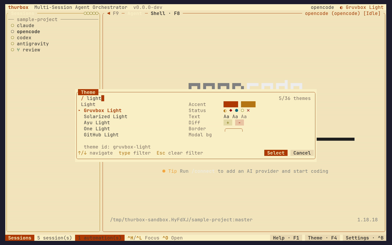
With Gruvbox Light previewing, the ` Sessions ` panel title is barely separable from the cream background, while the rows inside the panel stay perfectly legible. The title is the label a newcomer uses to know what a panel is.
**Fixed at the root.** `build_block` handed ratatui a bare string, so titles took the *terminal's* default foreground rather than a theme role. They now default to the border's style.
Fix: Derive panel titles from the theme's heading role rather than a fixed tint, and check the eight light palettes — this is a whole-family problem, not a Gruvbox one.
nit
The hint line correctly rewrites itself for the filtering modeusability
Before filtering the footer offers `j/k navigate · PgUp/PgDn page · / filter`; once `/` is pressed it becomes `↑/↓ navigate · type filter · Esc clear filter`. Dropping `j/k` is exactly right, because those letters now type into the query, and the live `5/36 themes` count confirms the filter took.
Fix: No change needed — worth keeping as the pattern the other filterable lists copy.
nit
Light themes leave agent output unreadablevisual
Under a light palette the opencode banner in the centre pane is near-invisible, because the agent draws its own colours for the dark background it assumes. thurbox is not at fault, but the consequence lands in thurbox's window and a reader of this screenshot cannot tell whose bug it is.
Fix: Nothing to fix in the renderer. Worth a line in the theme documentation: a light thurbox palette does not make a dark-assuming agent light, and most agents have their own theme setting for that.
New session: repo picker Ctrl+N
nit
Fixed: the footer overflows and clips its own buttonsvisual
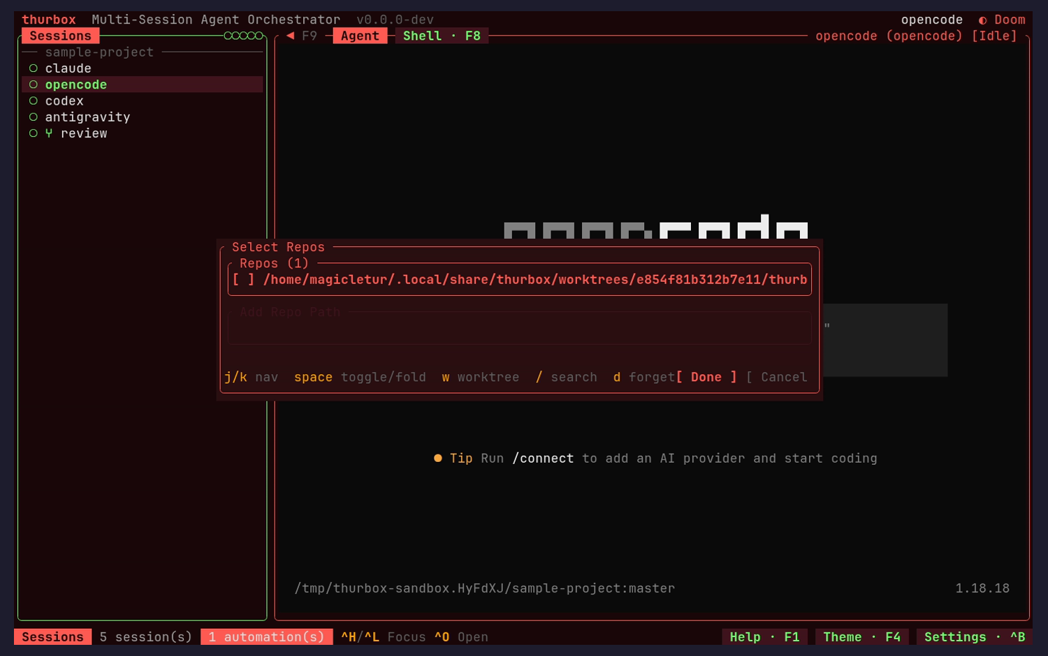
The hint row renders `d forget[ Done ] [ Cancel` — no space between the last hint and the first button, and `[ Cancel` loses its closing bracket at the panel edge. The two primary actions of the step are the part that gets cut.
**Fixed.** `" [ Cancel ]"` is eleven columns and the slot was hard-coded to ten. Both pills are measured from their own strings, and the leading space belongs to the pill so the gap survives when the hints fill their share.
Fix: Lay the footer out as hints-then-buttons with the buttons right-aligned and reserved first, dropping hints from the left when the width runs out. The buttons should be the last thing sacrificed, not the first.
nit
Fixed: the prefilled repo path is cut off at the part that identifies itusability
The candidate reads `/home/me/.local/share/thurbox/worktrees/a1b2c3d4e5f6a7b8/thurb` and stops at the panel edge with no ellipsis. Every character shown is shared boilerplate; the leaf that says which repository this is has been truncated away.
**Fixed.** `widgets.middle_truncate` keeps both ends, so the leaf survives. The interface row also carries an explicit name now rather than leading with its path.
Fix: Middle-truncate with a marker (`/home/…/a1b2c3d4/thurbox-v2-ui-approach-update`) so the head and the leaf both survive. The same rule fixes the Interface tab's path.
nit
An empty field's label is barely legiblevisual
`Add Repo Path` sits in a very dark grey on the near-black modal, which is the hardest state to read precisely when the field is empty and the label is the only thing explaining it.
Fix: Use the placeholder colour for empty-field labels, at the same contrast the filled `Repos (1)` title gets.
nit
Box inside a boxvisual
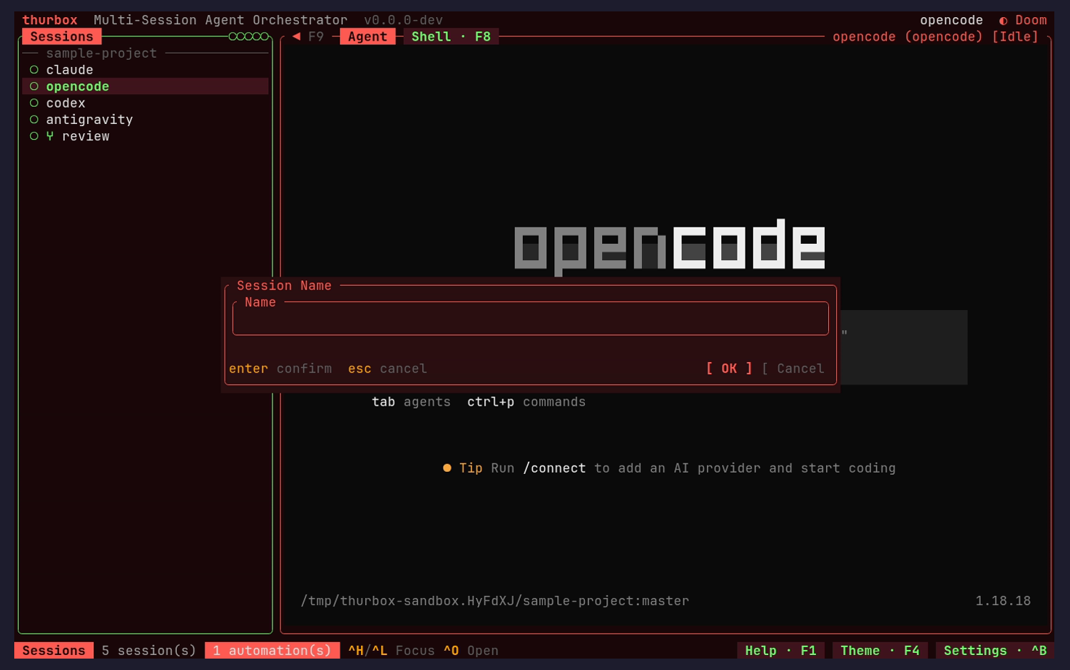
`Select Repos` frames `Repos (1)`, which frames the list, so two border rows and two titles are spent before any content. The naming step repeats the pattern with `Session Name` around `Name`.
Fix: Keep the outer frame and title the inner region with a plain heading row. It buys back two rows in a modal that is already clipping its footer.
New session: naming step Ctrl+N then Enter
nit
Fixed: the name field is empty, with no default and no placeholderusability
The previous step prefilled a repository, so the obvious default here — the repo's leaf name — is already known, yet the field is blank with nothing suggesting what a good answer looks like or what pressing Enter empty would do.
**Fixed.** the repository's leaf is offered as a placeholder and used when Enter arrives untouched. Deliberately not prefilled — `{ value, cursor }` has no selection, so the first keystroke would have appended.
Fix: Prefill the repo leaf (uniquified if it collides) and select it, so Enter is a valid answer and typing still replaces it.
nit
Fixed: a multi-step flow with no sense of where you areusability
Creating a session walks repos, name, agent and optionally host and branch, but no step shows a position or a path back. Escape is offered, and from a middle step it is unclear whether that abandons the step or the whole flow.
**Fixed.** the modal title carries a breadcrumb of what has been decided. A trail rather than a count, because the flow is conditional and a count would have to lie.
Fix: Put a `step 2 of 4` counter or a breadcrumb of the chosen values in the modal title, and label Escape for what it does at that point.
nit
The same two actions stated twice, and clipped againconsistency
The footer carries `enter confirm · esc cancel` on the left and `[ OK ] [ Cancel` on the right — one row saying the same thing twice — and `[ Cancel` is clipped exactly as in the repo picker.
Fix: Show the buttons with their chords on them (`[ OK · enter ]`, `[ Cancel · esc ]`) and drop the duplicate hints. Fixing the overflow once fixes both steps.
Keybindings help, rendered from the registry Ctrl+G
nit
A rebound chord says so, in the help itselfusability
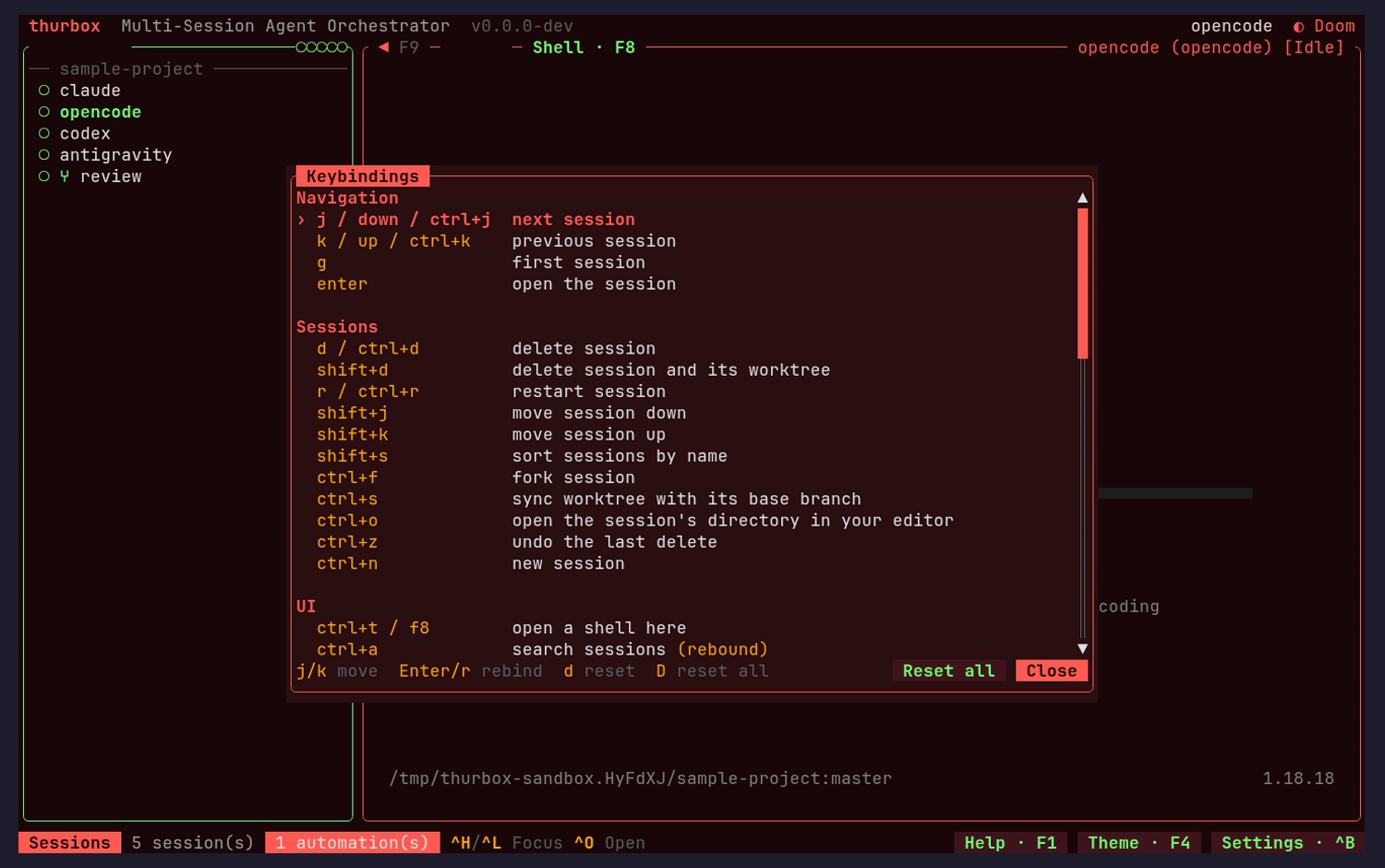
`ctrl+a search sessions (rebound)` marks the chord this capture remapped, so the help screen is visibly reporting the live registry rather than a table someone maintains by hand. The Navigation / Sessions / UI grouping and the alternate-chord column (`j / down / ctrl+j`) both read cleanly.
Fix: No change needed — this is the payoff of rendering help from the registry, and it is worth protecting in tests.
nit
A fourth selection markerconsistency
The selected row is marked `›` here, against `‣` in the theme picker and the search results and a filled background in the session list.
Fix: One marker everywhere; see the cross-screen recommendation.
nit
The list runs straight into its footervisual
The last visible binding sits on the row immediately above `j/k move · Enter/r rebind · d reset · D reset all`, with no rule or blank row between content and controls, so a partially scrolled list looks like it continues into the hint text.
Fix: Separate the footer with the same one-row gap or hairline the settings modal uses above its own breadcrumb.
Settings: core + plugin settings Ctrl+,
nit
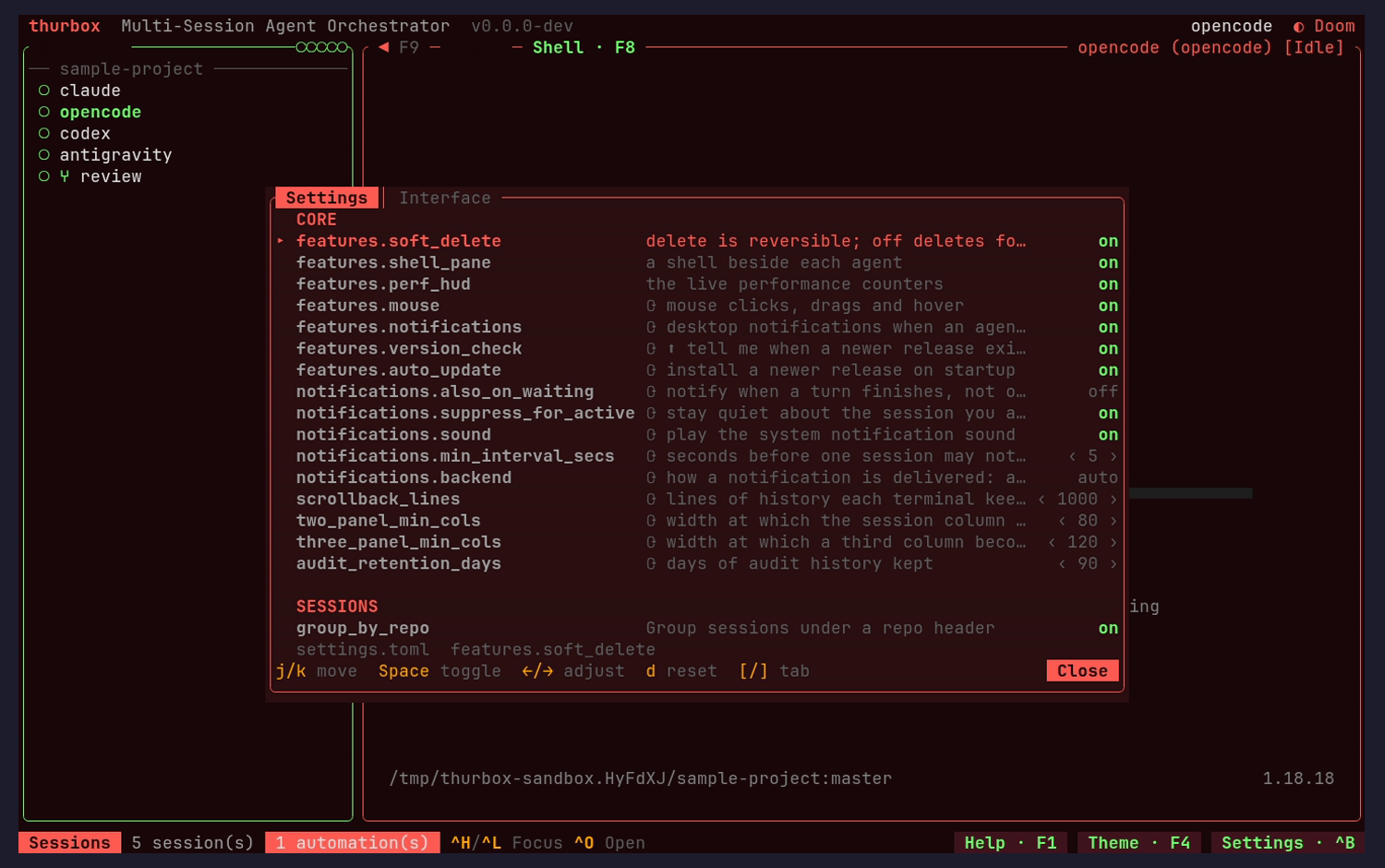
Fixed: a setting for a column that does not existusability
`three_panel_min_cols` offers to configure the `width at which a third column beco…`. The interface arranges two panes between three bands; there is no third column for this to govern, so the row is a control wired to nothing.
**Fixed.** the row is gone. The field stays parsed so an existing settings.toml keeps loading.
Fix: Delete the row. If the key must stay parseable for older files, keep it out of the panel — an offered control implies it works.
nit
Fixed: the restart-only marker does not rendervisual
Rows that need a restart are prefixed with a glyph that falls back to an unresolved character rather than the intended mark, and `features.version_check` shows a second, different mark as well. Neither is explained anywhere on the screen, so the one piece of information the marker carries — this will not take effect now — does not arrive.
**Fixed.** no monospace family here covers U+27F3, U+21BB or U+2B06 — `fc-list ':charset='` finds none, against fourteen for Geometric Shapes — so the mark is ASCII with `* needs restart` in the footer. A stray `⬆` inside one description went too.
Fix: Use a glyph from the geometric range the status dots already prove renders in this font stack, and add `↻ needs restart` to the footer as a legend.
nit
Fixed: description truncation has regressed since 1.xvisual
At 135 columns the modal takes roughly 930 of 1500 pixels and clips most descriptions around forty characters: `delete is reversible; off deletes fo…`, `seconds before one session may not…`, `lines of history each terminal kee…`. The 1.x review recorded this as fixed by widening the modal at >= 120 columns.
**Fixed, and the tier was never the problem.** the description column is what is left after the widest id and the widest value, so one 32-character id starved every row. Width is derived from the content now, as the height already was.
Fix: Restore the widening rule, and wrap the description to a second line rather than clipping when even the wide layout is not enough.
nit
The two halves are labelled by scope, not by consequenceusability
`CORE` and `SESSIONS` name where a setting comes from, but what a reader needs to know is that one half is written to `settings.toml` and the other takes effect on the next frame with nothing to save. Only the dim `settings.toml` breadcrumb hints at it.
Fix: Subtitle the sections with their behaviour — `CORE · settings.toml`, `SESSIONS · applies immediately` — so the absence of a Save button explains itself.
Settings: the Interface tab (plugin inventory) Ctrl+, then ]
nit
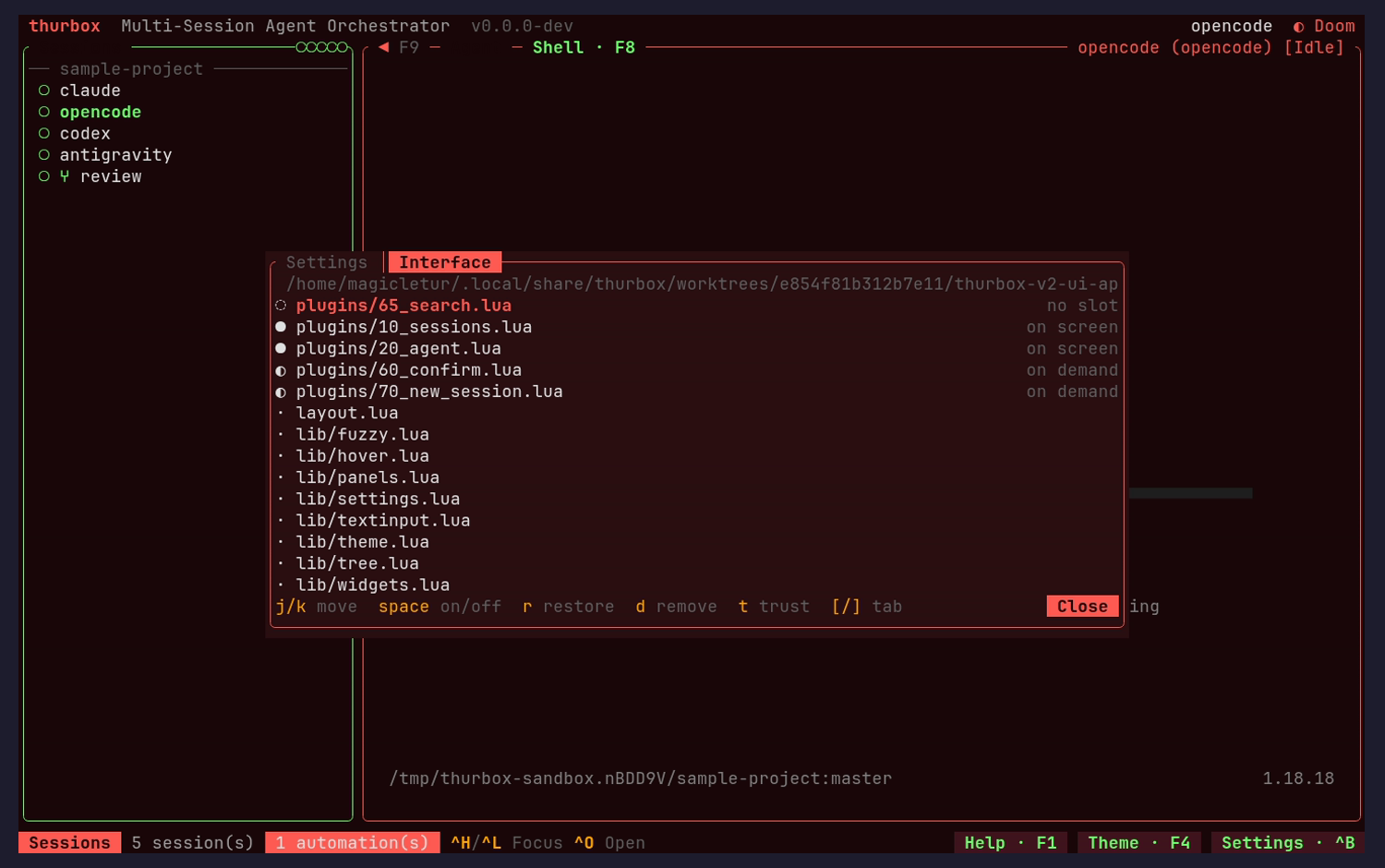
Fixed: a float at rest now reads `on demand`, not `on screen`consistency
`60_confirm.lua` and `70_new_session.lua` reported `on screen` permanently, because `focus::is_drawn` answered for anything *allowed* to float rather than for what had floated — on the one screen whose job is saying which files are drawing. The screenshot above is the re-capture: both now read `◐ on demand`, and `on screen` is left to the two panes actually painting.
Fix: `Placement` carries a `float_open` fact the loop fills from the floats it painted, and a new `State::OnDemand` keeps `Hidden` meaning what its own doc says (a slot held by someone else, or a closed column). Held by `a_closed_float_is_not_drawn_though_focus_may_still_go_there` and `a_float_drawing_nothing_is_reported_on_demand_rather_than_on_screen`.
nit
Withdrawn: provenance and trust are on the row alreadyusability
Reported as missing and they are not. The row builds a tail carrying `edited` / `yours` and the trust state, including the `trusted · modified` case — it just says nothing when there is nothing to say, and a default install is fourteen bundled files with no capability between them. Reading that as an absent column was a mistake in the review, not a gap in the tab.
Fix: No change. Saying `bundled · asks nothing` on all fourteen rows would bury the one row that differs, which is the row the screen exists for. Pinned instead by a test that renders the edited, yours, untrusted and drifted cases and asserts the shipped-and-unmodified row stays quiet.
nit
The state vocabulary has four words for three ideasusability
The column reads `no slot`, `on screen`, blank for libraries, and `off` once a pane is disabled. `no slot` in particular describes an implementation fact — search has no rect while its strip is closed — that a reader will parse as an error.
Fix: Use `closed` for a pane whose surface is not currently placed, `off` for disabled, `on demand` for floats and `— module` for the libraries.
nit
The directory in force is truncated mid-wordvisual
The header path ends `…/thurbox-v2-ui-ap` at the panel edge. Since three separate rules can choose this directory, which one is in force is precisely what a reader comes here to confirm.
Fix: Middle-truncate with a marker, and consider naming the rule that chose it the way `thurbox-cli plugin dir` does.
The arrangement after a pane is turned off space then Esc
nit
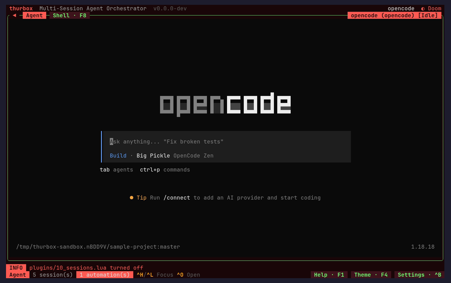
Fixed: turning a pane off now closes the arrangement upusability
Disabling `10_sessions.lua` left the left quarter of the window empty — no border, no content, the agent pane not a pixel wider — because `ui/layout.lua` gated the column on `panels.shown("sessions")`, which tracks only the F9 toggle, while the kernel's `resolve` drops a slot only when Lua omits it. The screenshot above is the re-capture after the fix: the agent takes the full width.
Fix: The kernel now publishes the slots a loaded plugin claims as `ctx.slots` (floats and decorators excluded, since neither fills a rect carved out of the screen) and the arrangement requires both switches to agree. Held by `a_disabled_pane_does_not_reserve_its_column`, which fails against the old condition, and by `a_float_does_not_make_its_slot_count_as_occupied`.
nit
The panel-toggle affordance loses its labelusability
The `◄ F9` hint above the centre pane becomes a bare `◄` once the session column is gone — the chord disappears at the exact moment the reader most needs to know how to get the column back.
Fix: Keep the chord on the affordance in both states; it is the recovery path from an empty-looking interface.
Per-session shell pane Ctrl+T
nit
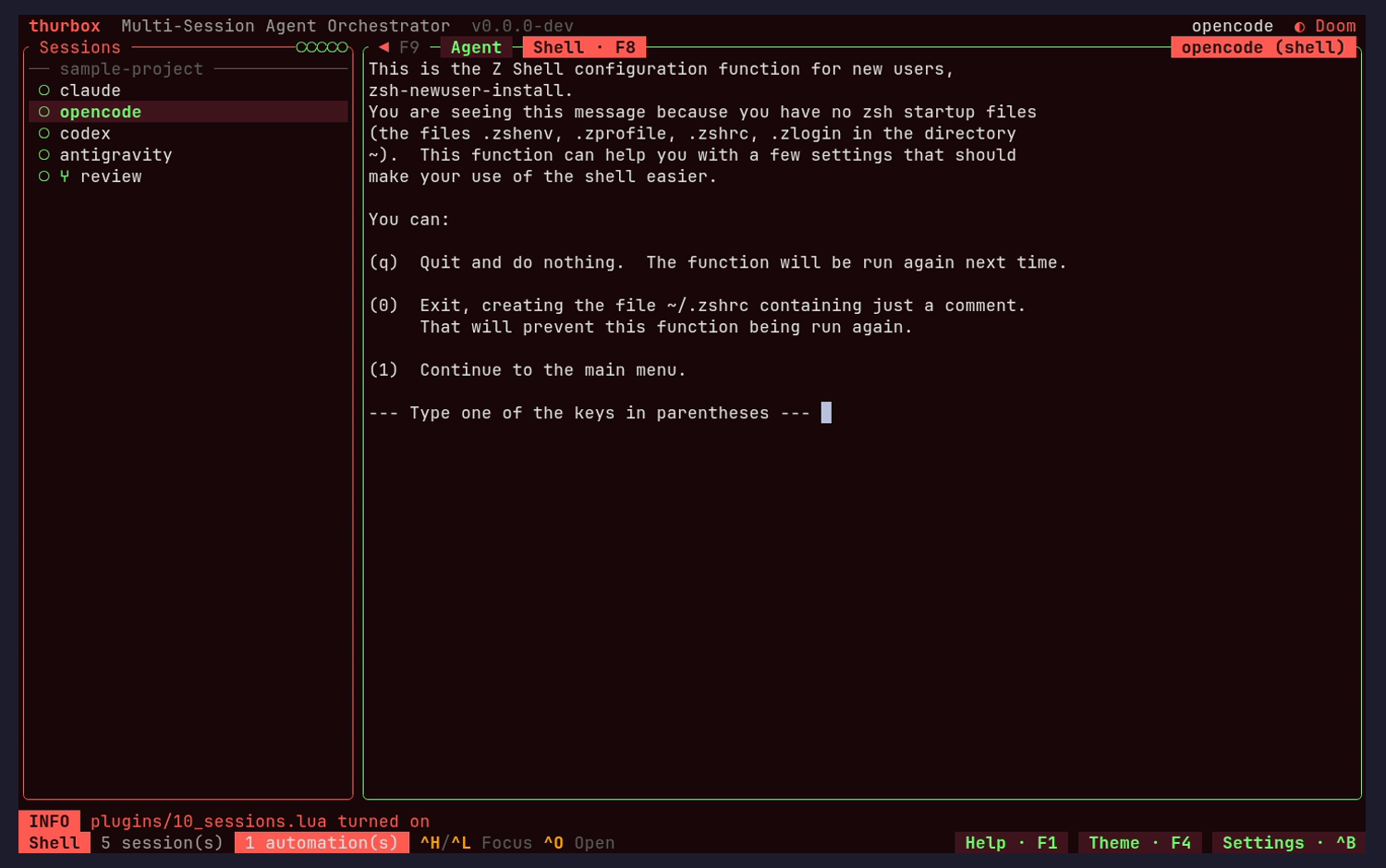
The toggle is cleanly reversible, and says sousability
`INFO plugins/10_sessions.lua turned on` confirms the action, the column returns intact, and the tab bar correctly moves the accent fill from `Agent` to `Shell · F8`. Nothing about turning a pane off risked the file.
Fix: No change needed.
nit
The message band has no visible lifetimeusability
The INFO row is still present several seconds and one view-change after the event that produced it, with no timestamp, no dismissal hint and no indication whether it will clear on its own or on the next message.
Fix: Either fade it on a timer or add a `· esc` affordance. The band already earns its row only when it has something to say, so saying when it will stop is the missing half.
nit
The session badge changes shape between viewsconsistency
The badge is `name (agent) [status]` over the agent and `name (shell)` over the shell, so the status disappears when you switch views even though the agent is still running and its status is still meaningful.
Fix: Keep the status segment in both views and let the middle segment name the view.